GIVINGCOMPASS
PLATFORM
WordPress
TIMELINE
6 weeks
TOOLS USED
Sketch, Adobe Illustrator, Pen & paper
THE ASK
2nd round of UX work, visual design.
MY ROLE
I was the sole consultant on this project working closely with two developers.
I was tasked with continuing to build on the existing design files and create an updated visual design - including icons - for the site to follow moving forward.
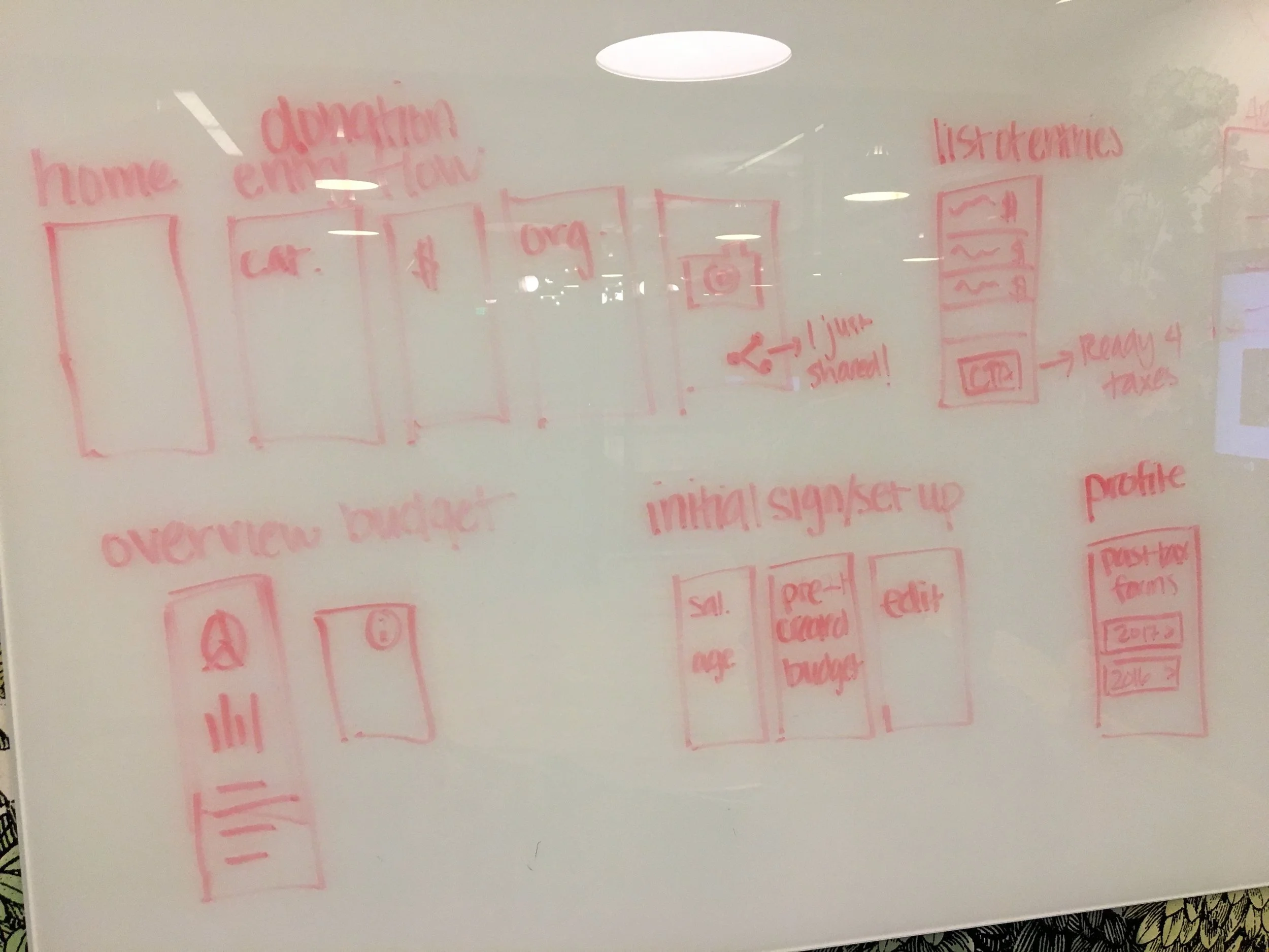
A PEEK AT MY PROCESS
PLANNING
I began with consuming the existing designs and holding a stakeholder interview with my main client to figure out where he wanted to pivot and what he was aspiring for GivingCompass.org to be able to accomplish.
PAGE LAYOUT / DESIGN UPDATES
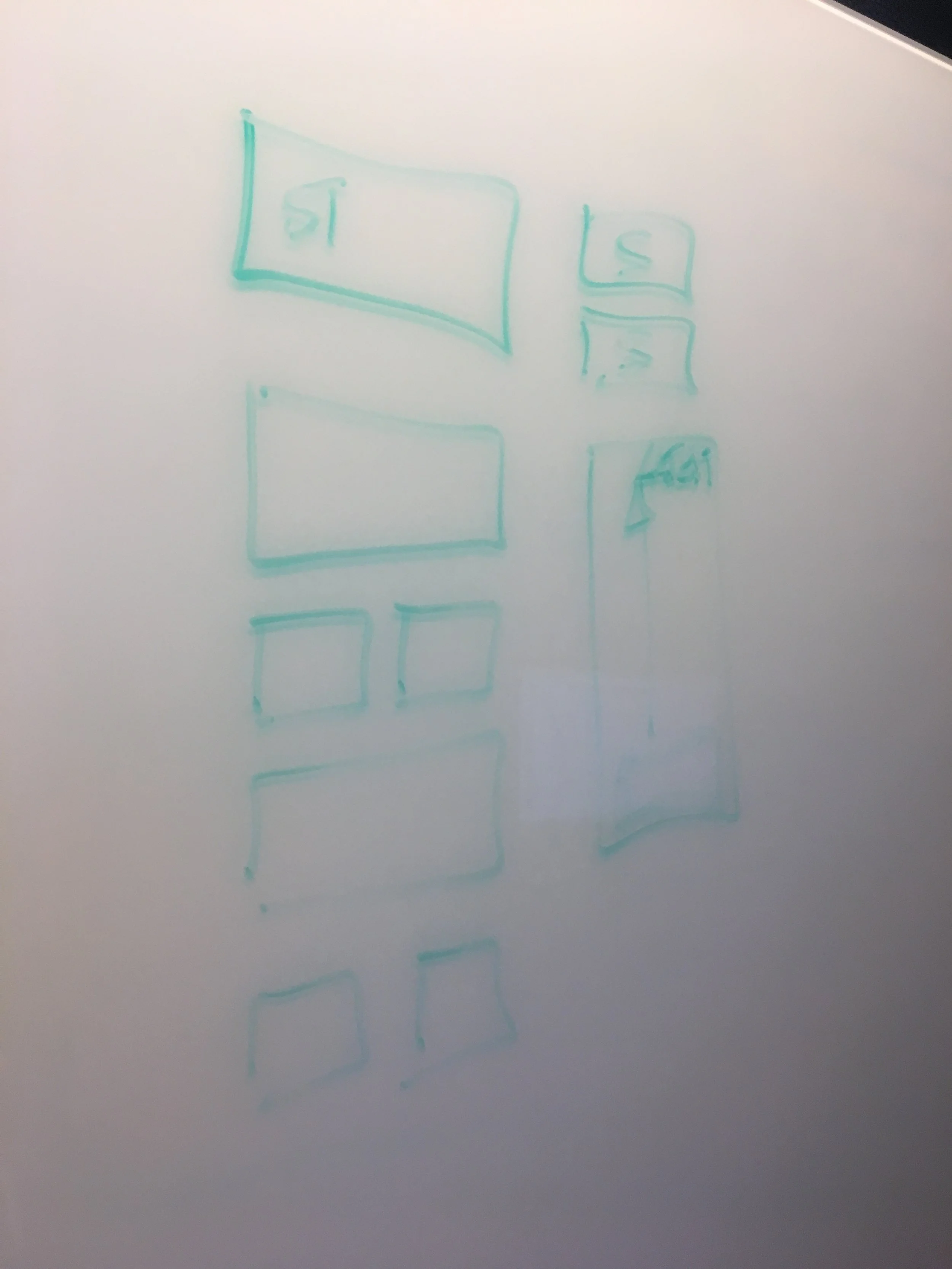
I started with creating a new visual design language and new component patterns, then split the rest of my time applying it to previously designed pages and creating new pages that followed that visual design. Below is an example of the type of design nuances that we spent our time evaluating throughout the project. I went high-fidelity pretty quickly to communicate those nuances more easily.
NAVIGATION UI
An interesting concept that my client's board wanted to explore was the idea of having a navigation that mimicked the movement of a compass. While visually, it was easy to achieve, it was harder to figure out how to develop a compass-style navigation that was ultimately built on a grid behind the scene and that also included a spinning needle.


